Post below recycled from The Register, an excellent British skeptical publication
The story is that the world is heating up - fast. Prominent people at NASA warn us that unless we change our carbon producing ways, civilisation as we know it will come to an end. At the same time, there are new scientific studies showing that the earth is in a 20 year long cooling period. Which view is correct? Temperature data should be simple enough to record and analyze. We all know how to read a thermometer - it is not rocket science.
Previously we looked at how US temperature data sets have been adjusted - with more recent versions of historical data sets showing a steeper rise in temperature than they used to. Here, we'll be looking at current NASA data and why their temperature maps appear hot-red, even when others are cool-blue.
To recap the earlier article, the graph below shows additional adjustments to the data set since the big "correction" in 2000.
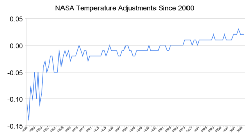
We observe that the data has been consistently adjusted towards a bias of greater warming. The years prior to the 1970s have again been adjusted to lower temperatures, and recent years have been adjusted towards higher temperatures.
NASA's published data is largely based on data from the US Historical Climatology Network (USHCN), which derives its data from thermometer readings across the country. According to USHCN literature, the raw temperature data is adjusted to compensate for geographical movements in the weather stations, changes in the 24-hour start/end times when the readings are taken, and other factors. USHCN is directly affiliated with the Oak Ridge National Laboratories' Carbon Dioxide Information Analysis Center, an organisation which exists primarily to promote the idea of a link between CO2 and climate.
The map below shows what the raw unadjusted USHCN temperature trends for the US in the 20th century looked like.
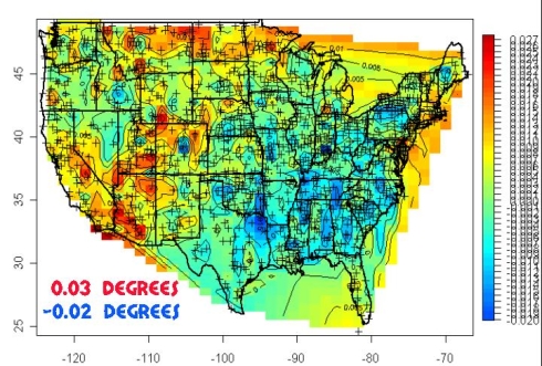
20th century temperature trends - USHCN raw data (lots of blue)
Prior to any adjustments, more than half the US shows declining temperatures over the 20th century - blue and green colors - i.e. the US is cooling down. However, subsequent to the adjustments the country goes dominantly warmer (red and yellow) - as seen in the image below.
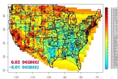
20th Century temperature trends - USHCN raw data (lots of red)
Below is a video showing the USHCN adjustments in action.
Divergence
So how does NASA's data compare with other temperature sources? As we explained in our earlier article, NASA data is derived from a grid of ground-based thermometers. During the last thirty years, we also have the benefit of more sophisticated technology - satellites which can indirectly record temperatures across most of the planet. The satellite data is from Remote Sensing Systems (RSS) and the University of Alabama at Huntsville (UAH).
In 1998 (left side of the graph below) NASA and the satellite data sources RSS and UAH all agreed quite closely - within one-tenth of a degree. Ten years later - in March 2008 - NASA is reporting temperature anomalies more than 0.5 degrees warmer than UAH. The divergence between NASA and UAH has increased at a rate of 0.13 degrees per decade (red lines below.) In contrast, RSS has converged with UAH over the period and is now within 0.02 degrees (blue lines below.)
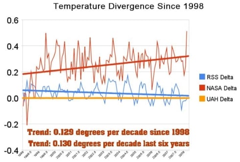
Differences between reported temperature anomalies, NASA, RSS and UAH - with UAH as the baseline.
Lost Continents
The divergence is now quite striking. Looking closer at March 2008, NASA's data shows the month as the third warmest on record. In sharp contrast, UAH and RSS satellite data showed March as the second coldest on record in the southern hemisphere, and just barely above average for the whole planet. How could such a large discrepancy occur?
Viewing the NASA 250-mile map for March below, what immediately grabs the attention is that NASA has essentially no data (gray areas) in most of Canada, most of Africa, the Greenland ice sheet, and most of Antarctica. This begs the question, how can one calculate an accurate "global temperature" while lacking any data from large contiguous regions of three continents?
So what was NASA missing?
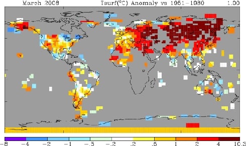
NASA Temperatures March, 2008 - 250-mile smoothing radius - looks hot
We can find NASA's lost continents in the UAH satellite data for March below.
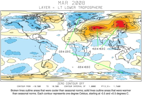
UAH Satellite Temperatures March, 2008 - looks cool
Not surprisingly, the missing areas in Canada and Africa were cold. The NASA data thus becomes disproportionately weighted towards warm areas - particularly in the northern hemisphere. As can be seen in the UAH satellite map above, the warm areas actually made up a relatively small percentage of the planet. The vast majority of the earth had normal temperatures or below. Given that NASA has lost track of a number of large cold regions, it is understandable that their averages are on the high side.
Additionally, NASA reports their global temperature measurements within one one-hundredth of a degree. This is a classic mathematics error, since they have no data from 20 per cent of the earth's land area. The reported precision is much greater than the error bar - a mistake which has caused many a high school student to fail their exams.
Cherry picking
A second important issue with NASA's presentation is that they use the time period of 1951-1980 as their choice of baseline. This was a well known cold spell, as can be seen in the 1999 version of the NASA US temperature graph below.
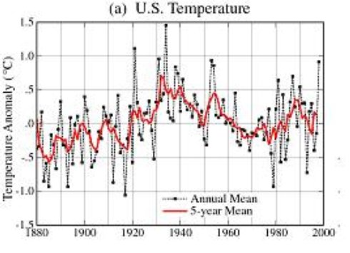
NASA US Temperature Map August, 1999. Note the cooling trend since 1930, and particularly between 1951 and 1980.
Temperatures dropped enough during that period to trigger concern about the onset of an ice age. Newsweek magazine went so far as to mention a proposed "solution" of spreading soot (http://www.denisdutton.com/cooling_world.htm) in the Arctic to melt the polar ice caps. 1978 was the coldest winter on record in much of North America. By using a cold baseline, all recent temperatures become relatively warm - which causes the NASA maps to be covered with lots of hot red and brown colors. From looking at the NASA map above, one could easily believe that that the earth is having a meltdown. By contrast, the UAH map makes most of the earth look quite cool.
When we look at the temperature data for Alaska, the disparity is again quite striking.
The NASA temperature map for March above shows Alaska temperatures much above "normal", while the UAH map shows Alaska temperatures well below "normal". This is partially due to the fact that the 1951-1980 NASA baseline period was unusually cold in Alaska - due to the cold phase of a dominant ocean cycle, the Pacific Decadal Oscillation (PDO), as shown below. The graph below indicates variations in Pacific temperatures, showing a cold period from 1950-1980 which exactly matches NASA's baseline period.
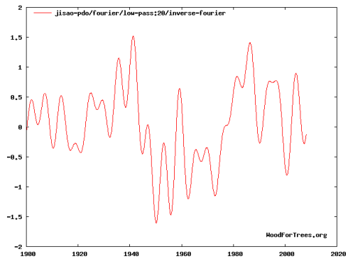
The Pacific Decadal Oscillation in its cold phase from 1951-1980 (the period of the NASA baseline)p>
When the PDO ocean pattern is in its cold cycle, the Pacific remains dominantly in the La Nina phase, causing cold temperatures - particularly around the Pacific basin. La Nina also causes cold northern hemisphere winter temperatures across much of the world - as measured in 2008.
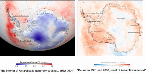
We can see how dramatic an artistic makeover can be. On the left, NASA's Goddard Space Flight Center shows that "the interior of Antarctica is generally cooling". Indeed, most of the landmass is cooler, or the same as it was, with patches of warming around the periphery.
On the right, NASA's Earth Observatory warns that "Between 1981 and 2007, most of Antarctica warmed" - and the graph is correspondingly crimson. For the colourists at the Earth Observatory, a mere +0.01C is needed to colour the continent red.
Conclusion
One month does not make a temperature trend, and the point of this article is not to ascertain whether or not the earth is warming towards Armageddon. We are not qualified to analyze that or second-guess the experts. What is being examined is the quality and stability of the data being used by people making those claims.
For example, whatever motivations NASA had for picking the 1951-1980 baseline undoubtedly have some valid scientific basis. Yet, when the data is calibrated in lockstep with a very high-profile and public political philosophy, we should at least be willing to ask some hard questions. Dr. James Hansen at GISS is the person in charge of the NASA temperature data. He is also the world's leading advocate of the idea of catastrophic global warming, and is Al Gore's primary climate advisor. The discrepancies between NASA and other data sources can't help but make us consider Einstein's advice:
"If the facts don't fit the theory, change the facts."
NHS dentistry becoming less and less accessible
Far fewer people see an NHS dentist than before a large-scale reorganisation of dentistry service, according to official figures. Data released yesterday by the NHS Information Centre showed that a total of 27.3 million patients — equivalent to 53.7 per cent of the population — saw an NHS dentist in the two years to December 2007. This compares with 28.1 million (55.8 per cent of the population) in the two years to April 2006, when the Government’s new dental contract was implemented. The contract’s aim was to increase access and simplify dental charges.
The report also showed wide variations across England in who gets access to an NHS dentist, with greater disparities among adults than children. Among adults, the proportion who had seen a dentist in the 24 months up to December 2007 ranged from 38.9 per cent in the South Central Strategic Health Authority area to 58.3 per cent in the North East. There was also a wide variation in the number of children who have access to dental services, with 73.4 per cent seeing a dentist over the same period in the North East compared with 64.8 per cent in London.
Recent surveys have suggested that scores of patients are being forced to pay for private dental treatment because of a lack of practitioners willing to carry out NHS work.
Current guidelines from the National Institute for Health and Clinical Excellence (NICE) suggest that people should see their dentist either every six months or at intervals of up to two years, as the practice sees fit.
The British Dental Association said the figures offered fresh evidence that ministers had failed to achieve their stated aims with the contract. Peter Ward, its chief executive, said: “They have failed to improve access to care for patients and failed to allow dentists to provide the modern, preventive care they want to deliver. “Instead, this contract encourages sporadic, episodic treatment rather than the long-term, continuing relationships that dentists and their patients value. “The Government must heed these statistics and work with patients and dentists to find constructive solutions to the problems with the reforms behind this decline.”
Experts said that patients who did not have regular check-ups could be storing up health problems. Ben Atkins, of Rocky Lane dental practice in Manchester, said: “If people are not going to the dentist regularly, they are not going to pick up warning signs and the small problems that can develop into serious problems such as tooth loss, abscesses and even cancer. Holes can develop in dental enamel in as little as a few months. They can be easily corrected with a filling, but if not checked early, they can cause greater decay down to the nerves.”
Conservatives said the figures suggested that 338,000 people lost NHS dentistry in the past three months of 2007 — equivalent to 3,674 a day. The information centre confirmed that the number of patients seing an NHS dentist “had been falling consistently over the past few years” and that this fall had been greatest between September and December last year. Mike Penning, the Conservatives’ health spokesman, said: “These figures are yet another damning indictment of Labour’s appalling management of NHS dentistry. The fact that over 300,000 people lost their dentist in three months alone shows just how bad things are getting.”
A survey of 5,000 patients and 700 dentists last year concluded that the quality of care patients had received since the introduction of the contracts has worsened. Among dentists, 45 per cent said they were not accepting any more NHS patients while nearly three quarters said that they were aware of patients declining treatment because of the cost. However, 93 per cent of patients receiving NHS dentistry said that they were were happy with the treatment provided.
Norman Lamb, Liberal Democrat health spokesman, said that the dental contract had been an “abject failure”. He added: “We need an urgent review into why reforms undertaken just two years ago have completely failed to improve access.”
Barry Cockcroft, the Chief Dental Officer, said: “Since the dental reforms, we have made expanding NHS dentistry a national priority and have invested an extra 200 million this year to help strengthen local services and open more practices. “The information centre access figures do not reflect the new services that are opening all the time. Rather, the figures are retrospective and include the temporary decrease in access which occurred following the transition to the new system in 2006.”
Source
Babies could soon have three parents
DESIGNER babies with three parents could be born within three years. The controversial technique screens an embryo created by a man and a woman for incurable genetic diseases. Defective DNA is replaced with that from another woman, effectively giving the baby two mothers and a father. Scientists at Newcastle University in the UK have already created embryos using the method and are perfecting it for use in IVF clinics. They say it could free children from diseases including some forms of diabetes, blindness and heart problems.
Critics say it could lead to genetically-modified babies being designed to order. UK law says embryos created using the technique must be destroyed, but scientists hope this can be overturned.
The research focuses on mitochondria "batteries" inside cells, which turn food into energy. Each mitochondrion has its own DNA, which is passed from mother to child. Defects in this DNA affect more than one in 5000 babies and cause around 50 genetic diseases, some of which kill before adulthood. The researchers have managed to swap the damaged DNA with healthy genetic material.
The first step is fertilisation of an egg through IVF. The embryo is screened for defects. When it is a few hours old, the nucleus containing genetic information from the parents is removed and put into another woman's healthy egg. Mitochondria are outside the nucleus so the baby is free of defects and will look like its "real" parents.
US biologist Professor Jonathan Van Blerkom told New Scientist magazine it would be "criminal" not to allow the technique to be used. There are fears that the influence of mitochondria on areas including longevity, IQ and fertility could lead to GM babies being made to order.
Source
A wonderful triumph against great odds: "Finley Crampton really shouldn't be here. Although his parents would have loved another child, they knew their baby could inherit a life-threatening kidney condition - and they couldn't take the risk. After all, their first son had died of the condition and the second was born with serious kidney damage. So when Finley's mother, Jodie Percival, became pregnant while on the Pill, she and her fiance Billy Crampton, 35, made the agonising decision to abort this child... However, Finley had other ideas. And some time after the operation, Miss Percival felt a fluttering in her stomach.... The child had survived the abortion and thrived in the womb... But a week later, another scan confirmed that this baby had kidney problems too, like the couple's previous children.... Her first baby, Thane, had lived for only 20 minutes after she was forced to deliver him prematurely. Her second son, Lewis, now 20 months, was born with a similar condition. He survives on one kidney... And in November, Finley was born three weeks premature, at 6lb 3oz. He had minor kidney damage but is expected to lead a normal life."

No comments:
Post a Comment